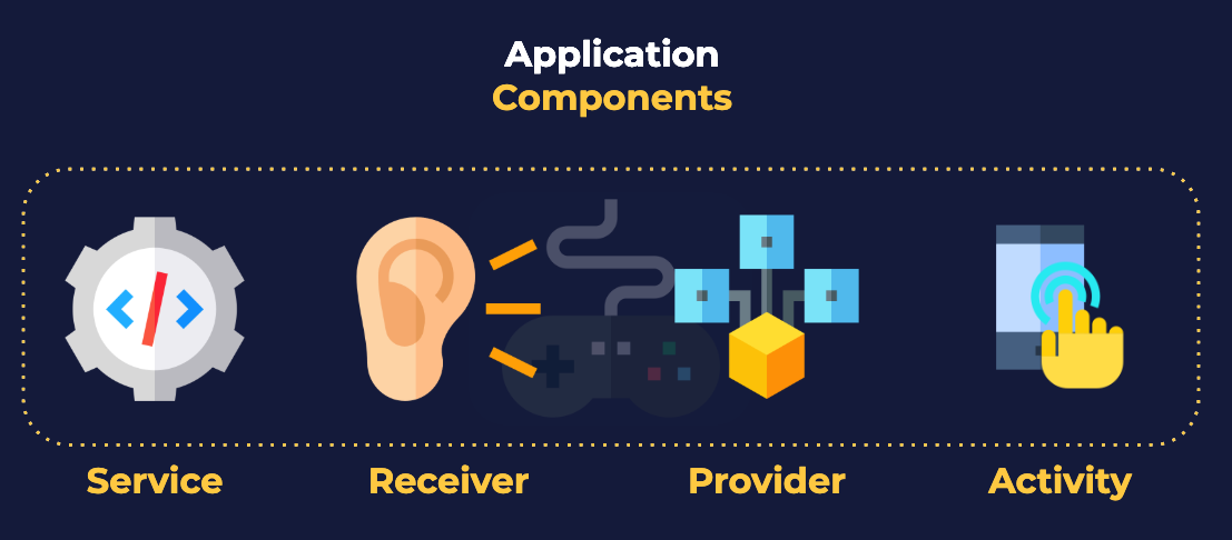
The ability to text, email, play games and much more are accomplished in Android applications through four top-level component classes: BroadcastReceiver, ContentProvider, Service, and Activity. These are all represented by Java Objects.
Activities provide the most visible of the application components. They present content to the screen and respond to user interaction. Activity components are the only components that present interactive content to the user. An Activity represents something an application can do, and an application often “does” several things – meaning, most applications provide more than one Activity .
In Android, Views are atomic, indivisible elements that draw themselves to the screen. They can display images, text, and more. Like periodic elements combine to form chemicals, we combine Views to form design components that serve a purpose to the user.
In Android, ViewGroups arrange Views (and other ViewGroups ) to form meaningful designs. ViewGroups are the special bond that combines Views to form design components that serve a purpose to the user. ViewGroups are Views that may contain other Views within them.

In Android, each layout is represented by an XML file. These plain text files serve as blueprints for the interface that our application presents to the user.
ConstratinLayout . >ImageView id="thumbnail" . />ImageView id="avatar" . />ImageView id="title" . />imageView id="subtitle" . />ConstratinLayout>
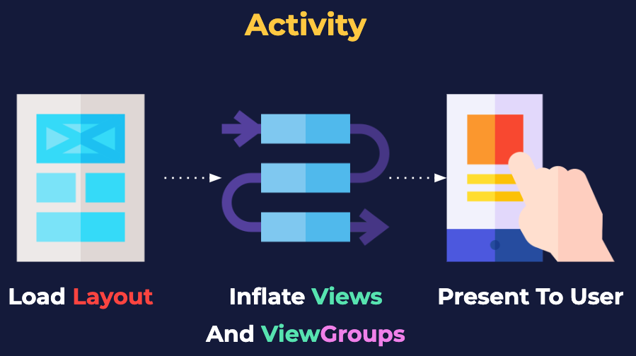
When Activities first launch, they read a layout file and convert it to a set of corresponding Java objects. These objects inherit from the base View object, and may draw themselves to the screen.

MotionEvent objects are created by Android after capturing user input from the touchscreen and translating it into operable data. All Views can respond to clicks, drags, swipes, and more by processing MotionEvents.

By default, all Views detect clicks and long-clicks.

During project creation, Android Studio associates the activity_main.xml layout file with the MainActivity object. The two are associated not by name, but by the setContentView method found in the Activity class. This complex method accepts a layout file resource identifier, generates the Views designed within, and presents them on screen — a process known as Layout Inflation
setContentView(R.layout.activity_main);
Activity objects may opt to present nothing to the screen, but the Android operating system always provides them with a Decor View. Decor View is the top-level ViewGroup in which Activity objects draw their content.

setContentView converts all the XML components in our layout into Java View objects, so after this method returns, we can access any View object from our layout programmatically. To find a specific View object, we invoke the findViewById() method. This method returns an object that inherits from the View object, or View itself.
public class MainActivity extends AppCompatActivity...setContentView(R.layout.activity_main);findViewById(R.id.incl_cardview_contact-card_main_1);...>
Resource qualifiers help us generate XML files for specific device configurations. Resource qualifiers allow us to create alternate versions of a resource tailored to one or more device factors: screen size, aspect ratio, android version, and others, such as screen orientation.
 are being selected. Under the 'Available qualifiers:' field label there is a list of labeled available qualifiers. Each available qualifier has an icon to the left of the label. The list has a vertical scroll bar on the right side which is positioned at the top of the list. The list of available qualifiers includes: - 'Country Code' which has a small globe icon in the bottom right of a paper icon. - 'Network Code' whose icon is a circular network icon in the bottom right of a paper icon. - 'Locale' whose icon is a globe. - 'Layout Direction' which has a left pointing arrow icon. - 'Smallest Screen Width' which has an icon that has an intersecting horizontal and vertical line both with arrows on each end. - 'Screen Width' that has a horizontal line icon with an arrow on each end. - 'Screen Height' whose icon has a vertical line with an arrow on each end. - 'Size' whose icon is a diagonal line going from bottom left to top right and has arrows at both ends. - 'Ratio' which has an icon with the text '4:3' (four to three). - 'Orientation' which has two device icons layered, one in landscape orientation layered on top of the other in portrait orientation. Because the scroll bar for the available qualifiers is positioned at the top of the list, we are unable to see the other available qualifiers." />
AndroidX is a support library designed to bring new features to old devices. AndroidX is a compatibility library that offers unique features and the latest APIs to versions of Android past & present. AndroidX enables older devices to have a taste of new APIs and Android technology.

Unlike LinearLayout , available in version one of the Android development kit, ConstraintLayout is not a part of any version of Android past or present and is only available through AndroidX.

In Android, namespaces help avoid attribute conflicts (two versions of the src attribute on a single ImageView , for example). Three common namespaces are: android , tools , and app . The android namespace belongs to the Android SDK and represents attributes available out-of-the-box. The app namespace allows us to reference attributes defined by external libraries (e.g. AndroidX) and those defined by our application. The tools namespace allows us to define attributes used exclusively for development, the user’s device never sees these attributes.
...xmlns:tools=""xmlns:app=""android:layout_height=""...
For Views to relate or constrain themselves to their siblings, they need a way to reference them — resource identifiers satisfy this need.

The component palette provides a selection of elements that we may drag and drop right into our layout.

Google introduced Material Design in 2014 to help standardize the appearance of web and mobile applications across the Google ecosystem. Material Design continues to evolve and is available for iOS, Android, and several web frameworks—however, applying its principles is entirely optional.
 most device is a representation of an Android phone, the middle device is a representation of an iPhone, and the right-most device is a representation of a tablet. Each of the devices have a purple colored header that takes up the entire width of the device screen. On the left of the header there is a hamburger icon (three horizontal lines) followed by the text 'ToDo App'. Under the header is a list of four tasks, each with a title that is left justified. Under each task title there is more descriptive text in a smaller sized and lighter colored font. The last task in the list is highlighted in a pink rectangle. There is a purple circular button in the bottom right corner with a plus sign icon in the center. Each of the phone devices has a check box for each task and this check box is right justified across from the task title and descriptive text. The tablet device instead has the list of tasks taking up about 1/3rd of the width of the device on the left side. On the right side of the device screen we see a card with the title of the selected task (highlighted in a pink rectangle) with the date written under the title. The date also has a calendar icon to the left of the date text. On the right side of the card there is a check box for the task. " width="" />
By right-clicking any element within the component palette, we may navigate to its respective documentation or Material Design guidelines.
The purpose and behavior of most Views, including CardView , are inspired by Material Design guidelines. Google introduced Material Design in 2014 to help standardize the appearance of web and mobile applications across the Google ecosystem.

ConstraintLayout arranges its children relative to itself and other children (leftOf, rightOf, below, etc.). It is more complex than a linear or frame layout, but it’s a lot more flexible. It’s also much more efficient for complex UIs as it gives you a flatter view hierarchy, which means that Android has less processing to do at runtime. Another advantage of using constraint layouts is that they’re specifically designed to work with Android Studio’s design editor. Unlike linear and form layouts where you usually make changes to XML, you build constraint layouts visually. You drag and drop GUI components onto the design editor’s blueprint tool, and give it instructions for how each view should be displayed.

In Android, LinearLayout arranges its children in a straight line, either horizontally or vertically. If it is vertically, they’re displayed in a single column, and if it’s horizontally, they’re displayed in a single row.

LinearLayout is ‘top-down’ and dictates the final position to each child, whereas ConstraintLayout is primarily ‘bottom-up,’ as it requires its children to supply position-related attributes.

Children of ConstraintLayout must provide one horizontal and one vertical constraint to define their position within the ConstraintLayout . Android Studio will warn us if we have set neither vertical nor horizontal constraints for any child component of a ConstraintLayout.

Margins introduce space between Views, and Views often benefit from the “breathing room” margins provide.

Android project files belong to one of three main categories: configuration, code, and resource. Configuration files define the project structure, code files provide the logic, and resource files are pretty much everything else.

The Android Studio Layout Editor includes two tabs: Text and Design . The Text tab edits the underlying XML file directly, and the Design tab provides a drag-and-drop interface for achieving the same results.

In Android, two attributes are mandatory within every layout: layout_width and layout_height , and the most common values for these attributes are match_parent and wrap_content .